How to create a heatmap (Updated!)
A heatmap is basically a table that has colors in place of numbers. Colors correspond to the level of the measurement. Each column can be a different metric like above. It’s useful for finding highs and lows and sometimes, patterns.
From Nathan Yau | Visualize This
One of the problems when we have a big quantity of data is the correct way to visualize and offer to the reader a simple but general vision about all the information.
In order to visualize trends within large sets of data, it is useful consider to create a data heat map with color instead of a table with numbers.
And as everything in life, there ain’t no such thing as a free lunch, and is completely valid in this case: the accuracy is lost because we are replacing numbers for a range of colors, but in exchange we are obtaining a wide vision about trends.
The colors used within the heat map, belong a spectrum of colors based on its distance from the statistical mean, so, in that way, intuitively darker colors means one thing and lighter colors means another thing facilitating a quick evaluation about patterns, maximum and minimum values.
Updates (Sat 11/24/2018)
After some comments made by u/ELKronos and u/prv about how to improve this example, I added how the data looks like before and after tranformations.
Idea
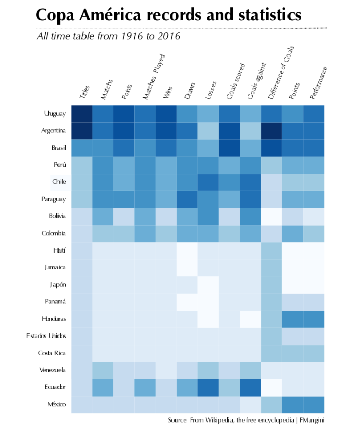
Let’s use a heatmap in order to visualize the stats for America Soccer Cup since the beginning of the times (well, actually since 1916).
Data
In order to see what we are obtaining in exchange, let’s take a look to the table with the stats for America Soccer Cup
| Team | Titles | Match | Points | Matches Played | Wins | Drawn | Losses | Goals scored | Goals against | Difference of Goals | Points | Performance |
|---|---|---|---|---|---|---|---|---|---|---|---|---|
| Argentina | 14 | 41 | 398 | 189 | 120 | 38 | 31 | 455 | 173 | +282 | 2,11 | 70,19% |
| Uruguay | 15 | 43 | 358 | 197 | 108 | 34 | 55 | 399 | 218 | +181 | 1,82 | 60,58% |
| Brasil | 8 | 35 | 332 | 178 | 99 | 35 | 44 | 405 | 200 | +205 | 1,87 | 62,17% |
| Paraguay | 2 | 36 | 225 | 168 | 62 | 39 | 67 | 253 | 293 | -40 | 1,34 | 44,64% |
| Chile | 2 | 38 | 222 | 177 | 64 | 30 | 83 | 281 | 304 | -23 | 1,25 | 41,81% |
| Perú | 2 | 31 | 197 | 148 | 54 | 35 | 59 | 213 | 232 | -19 | 1,33 | 44,37% |
| Colombia | 1 | 21 | 150 | 113 | 42 | 24 | 47 | 131 | 184 | -53 | 1,33 | 44,25% |
| Bolivia | 1 | 26 | 86 | 112 | 20 | 26 | 66 | 104 | 279 | -175 | 0,77 | 25,60% |
| México | 0 | 10 | 70 | 48 | 19 | 13 | 16 | 66 | 62 | +4 | 1,46 | 48,61% |
| Ecuador | 0 | 27 | 70 | 118 | 16 | 22 | 80 | 127 | 311 | -184 | 0,59 | 19,77% |
| Venezuela | 0 | 17 | 34 | 62 | 7 | 13 | 42 | 47 | 171 | -124 | 0,55 | 18,28% |
| Costa Rica | 0 | 5 | 18 | 17 | 5 | 3 | 9 | 17 | 31 | -14 | 1,06 | 35,29% |
| Estados Unidos | 0 | 4 | 17 | 18 | 5 | 2 | 11 | 18 | 29 | -11 | 0,94 | 31,48% |
| Honduras | 0 | 1 | 10 | 6 | 3 | 1 | 2 | 7 | 5 | +2 | 1,67 | 55,55% |
| Panamá | 0 | 1 | 3 | 3 | 1 | 0 | 2 | 4 | 10 | -6 | 1,00 | 33,33% |
| Japón | 0 | 1 | 1 | 3 | 0 | 1 | 2 | 3 | 8 | -5 | 0,33 | 11,11% |
| Jamaica | 0 | 2 | 0 | 6 | 0 | 0 | 6 | 0 | 9 | -9 | 0,00 | 0,00% |
| Haití | 0 | 1 | 0 | 3 | 0 | 0 | 3 | 1 | 12 | -11 | 0,00 | 0,00% |
As you can see, it is extremely complicated achieves any conclusion easily.
Visualization
This is the visualization for the data about America Soccer Cup, and it is very simple to determinate which are the best team along the different tournaments, even when we lost accuracy for the lacks of numbers for each event.
Some ideas that we can elaborate after check this visualization:
- Argentina and Uruguay are the best team along all the tournaments.
- Argentina is the team with more power of goals and best difference of goals.
- Argentina, Brazil and Uruguay are the teams with best performance.
- There are three groups of countries with similar trajectories:
- Argentina and Uruguay
- Brazil, Peru, Chile, Paraguay, Bolivia and Colombia
- The rest of the teams with low performance since Bolivia to Mexico
Technical implementation
In order to facilitate the implementation for any heatmap, I am going to separate the code in different sections and elaborate an small explanation of each part, however if you want to see all the code and the dataset used in this example, check my github account.
1. Setup libraries
We will use two libraries, readr to read a csv file – the dataset – and RColorBrewer, to use the palettes of colors.
library(readr)
library(RColorBrewer)
2. Get the data
The dataset is in my Github account because I prefer that my examples work out-of-the-box (if you copy, paste and execute the example, the code should work).
A second benefit of that is no matter what happen with the original dataset used in my example, I have it in your account.
# get data
url_soccer <- 'https://raw.githubusercontent.com/frm1789/soccer_ea/master/AmericaCupData.csv'
df_soccer <- read_csv(url(url_soccer))
3. Order by
From all the data that we have, the most relevant is the quantity of titles that a team have. All the rest (goals, power of goals, won matches…) is subordinate to that.
# Order data for titles
df_soccer <- df_soccer[order(df_soccer$Titles, decreasing = FALSE),]
df_soccer <- data.frame(df_soccer)
3. Transformations
One main point to consider, the function heatmap requieres a numerical matrix, for that reason we will work to delete the columns that we don’t need and transform the rest in numeric columns.
How the data is before transformation?
| Team | Titles | Match | Points | Matches.Played | Wins | Drawn | Losses | Goals.scored | Goals.against | Difference.of.Goals | Points_1 | Performance | |
|---|---|---|---|---|---|---|---|---|---|---|---|---|---|
| 1 | México | 0 | 10 | 70 | 48 | 19 | 13 | 16 | 66 | 62 | 4 | 1,46 | 48,61% |
| 2 | Ecuador | 0 | 27 | 70 | 118 | 16 | 22 | 80 | 127 | 311 | -184 | 0,59 | 19,77% |
| 3 | Venezuela | 0 | 17 | 34 | 62 | 7 | 13 | 42 | 47 | 171 | -124 | 0,55 | 18,28% |
| 4 | Costa Rica | 0 | 5 | 18 | 17 | 5 | 3 | 9 | 17 | 31 | -14 | 1,06 | 35,29% |
| 5 | Estados Unidos | 0 | 4 | 17 | 18 | 5 | 2 | 11 | 18 | 29 | -11 | 0,94 | 31,48% |
| 6 | Honduras | 0 | 1 | 10 | 6 | 3 | 1 | 2 | 7 | 5 | 2 | 1,67 | 55,55% |
| 7 | Panamá | 0 | 1 | 3 | 3 | 1 | 0 | 2 | 4 | 10 | -6 | 1,00 | 33,33% |
| 8 | Japón | 0 | 1 | 1 | 3 | 0 | 1 | 2 | 3 | 8 | -5 | 0,33 | 11,11% |
| 9 | Jamaica | 0 | 2 | 0 | 6 | 0 | 0 | 6 | 0 | 9 | -9 | 0,00 | 0,00% |
| 10 | Haití | 0 | 1 | 0 | 3 | 0 | 0 | 3 | 1 | 12 | -11 | 0,00 | 0,00% |
| 11 | Colombia | 1 | 21 | 150 | 113 | 42 | 24 | 47 | 131 | 184 | -53 | 1,33 | 44,25% |
| 12 | Bolivia | 1 | 26 | 86 | 112 | 20 | 26 | 66 | 104 | 279 | -175 | 0,77 | 25,60% |
| 13 | Paraguay | 2 | 36 | 225 | 168 | 62 | 39 | 67 | 253 | 293 | -40 | 1,34 | 44,64% |
| 14 | Chile | 2 | 38 | 222 | 177 | 64 | 30 | 83 | 281 | 304 | -23 | 1,25 | 41,81% |
| 15 | Perú | 2 | 31 | 197 | 148 | 54 | 35 | 59 | 213 | 232 | -19 | 1,33 | 44,37% |
| 16 | Brasil | 8 | 35 | 332 | 178 | 99 | 35 | 44 | 405 | 200 | 205 | 1,87 | 62,17% |
| 17 | Argentina | 14 | 41 | 398 | 189 | 120 | 38 | 31 | 455 | 173 | 282 | 2,11 | 70,19% |
| 18 | Uruguay | 15 | 43 | 358 | 197 | 108 | 34 | 55 | 399 | 218 | 181 | 1,82 | 60,58% |
Validations before changes
All the rest of the data into the dataset is numeric or integer exceptPoints_1 andPerformance.
sapply(df_soccer, class)
(...)
# Points_1
# "character"
# Performance
# "character"
Code for changes
# heatmap requieres a numerical matrix, for that reason we will move the names of the team as row.names
# and after that, we will delete the column "Team"
row.names(df_soccer) <- df_soccer$Team
df_soccer <- df_soccer[,-1]

# transformation to numeric for column "Points_1"
options(digits=2)
df_soccer$Points_1 <- sub(',', '.', df_soccer$Points_1)
df_soccer$Points_1 <- as.double(df_soccer$Points_1)

# transformation to numeric for column "Performance"
df_soccer$Performance = substr(df_soccer$Performance,1,nchar(df_soccer$Performance)-1)
df_soccer$Performance <- sub(',', '.', df_soccer$Performance)
df_soccer$Performance <- as.double(df_soccer$Performance)
df_soccer$Performance <- log(df_soccer$Performance)

# Dataframe to matrix
america_matrix <- data.matrix(df_soccer)
How the data is after transformation?
| Titles | Match | Points | Matches.Played | Wins | Drawn | Losses | Goals.scored | Goals.against | Difference.of.Goals | Points_1 | Performance | |
|---|---|---|---|---|---|---|---|---|---|---|---|---|
| México | 0 | 10 | 70 | 48 | 19 | 13 | 16 | 66 | 62 | 4 | 1.46 | 3.88382927105736 |
| Ecuador | 0 | 27 | 70 | 118 | 16 | 22 | 80 | 127 | 311 | -184 | 0.59 | 2.98416563718253 |
| Venezuela | 0 | 17 | 34 | 62 | 7 | 13 | 42 | 47 | 171 | -124 | 0.55 | 2.905807566026 |
| Costa Rica | 0 | 5 | 18 | 17 | 5 | 3 | 9 | 17 | 31 | -14 | 1.06 | 3.56359963768718 |
| Estados Unidos | 0 | 4 | 17 | 18 | 5 | 2 | 11 | 18 | 29 | -11 | 0.94 | 3.4493524235492 |
| Honduras | 0 | 1 | 10 | 6 | 3 | 1 | 2 | 7 | 5 | 2 | 1.67 | 4.01728351608564 |
| Panamá | 0 | 1 | 3 | 3 | 1 | 0 | 2 | 4 | 10 | -6 | 1 | 3.50645789231965 |
| Japón | 0 | 1 | 1 | 3 | 0 | 1 | 2 | 3 | 8 | -5 | 0.33 | 2.40784560365154 |
| Jamaica | 0 | 2 | 0 | 6 | 0 | 0 | 6 | 0 | 9 | -9 | 0 | -Inf |
| Haití | 0 | 1 | 0 | 3 | 0 | 0 | 3 | 1 | 12 | -11 | 0 | -Inf |
| Colombia | 1 | 21 | 150 | 113 | 42 | 24 | 47 | 131 | 184 | -53 | 1.33 | 3.78985537145394 |
| Bolivia | 1 | 26 | 86 | 112 | 20 | 26 | 66 | 104 | 279 | -175 | 0.77 | 3.24259235148552 |
| Paraguay | 2 | 36 | 225 | 168 | 62 | 39 | 67 | 253 | 293 | -40 | 1.34 | 3.79863031807306 |
| Chile | 2 | 38 | 222 | 177 | 64 | 30 | 83 | 281 | 304 | -23 | 1.25 | 3.73313554536847 |
| Perú | 2 | 31 | 197 | 148 | 54 | 35 | 59 | 213 | 232 | -19 | 1.33 | 3.79256356539082 |
| Brasil | 8 | 35 | 332 | 178 | 99 | 35 | 44 | 405 | 200 | 205 | 1.87 | 4.12987256828125 |
| Argentina | 14 | 41 | 398 | 189 | 120 | 38 | 31 | 455 | 173 | 282 | 2.11 | 4.25120585074233 |
| Uruguay | 15 | 43 | 358 | 197 | 108 | 34 | 55 | 399 | 218 | 181 | 1.82 | 4.10396480559909 |
Validations after changes
We can see that all the variables in our dataframe now are integer and after transformations, numeric.
sapply(df_soccer, class)
(...)
# Points_1
# "numeric"
# Performance
# "numeric"
4. Creating a heatmap
We are using the function heatmap almost out of the box, except the adding of margins and colors.
# Creation of heatmap
america_heatmap <- heatmap(america_matrix, Rowv=NA,
                           Colv=NA, col = brewer.pal(9, "Blues"), scale="column",
                           margins=c(2,6))