Tag / heatmap
-
![]()
How to create a Heatmap (II): heatmap or geom_tile
Heatmaps visualise data through variations in colouring. There are different functions to create a heatmap, one of them is using the heatmap function, but it is also possible to create a heatmap using geom_tile from ggplot2. The election for one of these function relies on the dataset. Below there is an example developed step by…
-
![]()
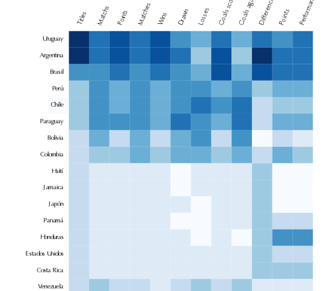
How to create a heatmap (Updated!)
A heatmap is basically a table that has colors in place of numbers. Colors correspond to the level of the measurement. Each column can be a different metric like above. It’s useful for finding highs and lows and sometimes, patterns. From Nathan Yau | Visualize This One of the problems when we have a…
Loading posts...