How to show correlations between variables?
When we work with linear regression we need to understand the relationship between the variables, that is, which variables depend on others, for this we analyze the correlation between the different variables that make up our dataset.
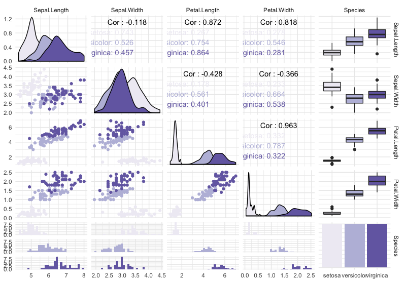
Below is an example using ggally one of the many libraries that allow us to perform this analysis between variables in graphic form:
ggally
One of the friendliest ways to perform this type of analysis especially if we are used to using the ggplot2 library. It can be customized by adding themes, easily changing the color palette and adding titles and information to give context to our visualization.
Technical implementation
We are going to need the ggally library, but also to change both the graphics corresponding to discrete and continuous variables we need functions that come from ggplot2. This code is also in my Github account.
#install.packages("GGally")
library(ggplot2)
library(GGally)

ggplot <- function(...)
ggplot2::ggplot(...) + scale_color_brewer(palette="Purples") + scale_fill_brewer(palette="Purples")
unlockBinding("ggplot",parent.env(asNamespace("GGally")))
assign("ggplot",ggplot,parent.env(asNamespace("GGally")))

graph_corr <- ggpairs(iris, mapping = aes(color = Species),
                      columns = c('Sepal.Length', 'Sepal.Width', 'Petal.Length', 'Petal.Width', 'Species'),
                      columnLabels = c('Sepal.Length', 'Sepal.Width', 'Petal.Length', 'Petal.Width', 'Species'))
graph_corr <- graph_corr + theme_minimal()
graph_corr