6 Tips to make your visualizations look professional [Updated]
When I started working with R, as any beginner I wanted a code that really works and a image minimally understandable, and for a long time that was my main objective, but once that point was over, I realized that my visualizations looked terrible, specially after comparing and reviewing other blogs and websites, so I began to search how to improve my visualizations.
Below, some tips to create a simple but professional image, to attract the attention of the reader.
Creating a visualization
Let’s gonna work with a simple visualization, an histogram from diamonds dataset.
library(ggplot2)
visualization <- ggplot(diamonds, aes(carat, fill = cut)) +
                    geom_histogram(bins = 30)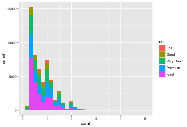
1. 1. Include context information: title, subtitle and footnote
Why we are adding this information? Because it is a quick and easy way to give context to the graphic and allow the reader to understand what we are talking about.
A second reason for adding this information is create a common understanding about what we are seeing. All the text allows us to “speak” with the reader and say:
- You are looking at a graph that shows the “Dataset Diamonds histogram”,
- This graphic “allows us to see” the distribution of carats.
- The source is this data is the gglopt2 package, and the author of this graphic is the blog thinkingondata.com
Another consideration is, if you are including the source, you are adding a credibility layer to your work, because the reader know where your data is come from.
visualization <- visualization +
labs(
title ="Histogram for Diamond dataset",
subtitle = "This is a general example in order to show the distribution of carats.",
caption = "source: gglopt2 package\nauthor: thinkingondata.com")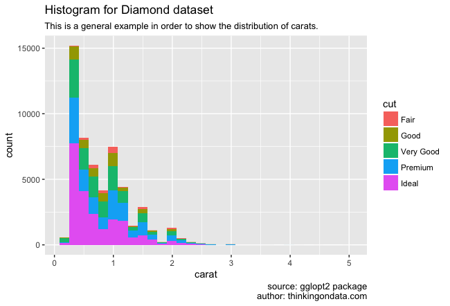
1. 2. Include a professional palette of colors
I fell in love with the Viridis palette, so I’m including it in all my graphics, using the same palette all the time makes the process to choose colors terribly easy and at the same time, as a secondary benefit unifies all the visualizations of my work (in this case for my blog).
visualization <- visualization +
scale_fill_viridis(discrete = TRUE)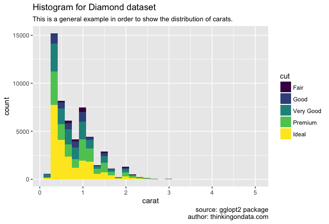
1. 3. Include a theme
Including a theme allows us to give a predefined format to our visualization, let’s think of it as the difference between a document written in Times New Roman or the same document in Helvetica.
We can use the same theme in all the visualizations in the same presentation in order to create the sense of uniformity, for example in this blog all the visualization are using the same theme: theme_minimal. There are a lot of pre defined themes and if you feel that you want something special, there is always the chance to create your own theme.
visualization <- visualization +
theme_minimal()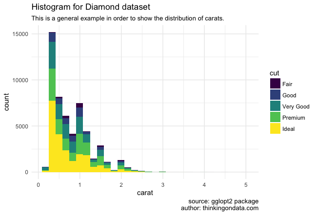
1.4. Remove variables
Many times, too much information deflects the attention of the reader, something is a good idea remove implicit information from your visualization, in this case I consider that we don’t need to include the name of the variables in the axis.
Despite you can remove the x-axis label, that is not always a good idea: depends a lot of the title and presentation format of the visualization. In some cases if you are including the same information into the title, removing the label could be a good option. (Thank you for the comments made by u/JepsonNomad and u/2strokes4lyfe)
visualization <- visualization +
theme(axis.title.x=element_blank(),
axis.title.y=element_blank())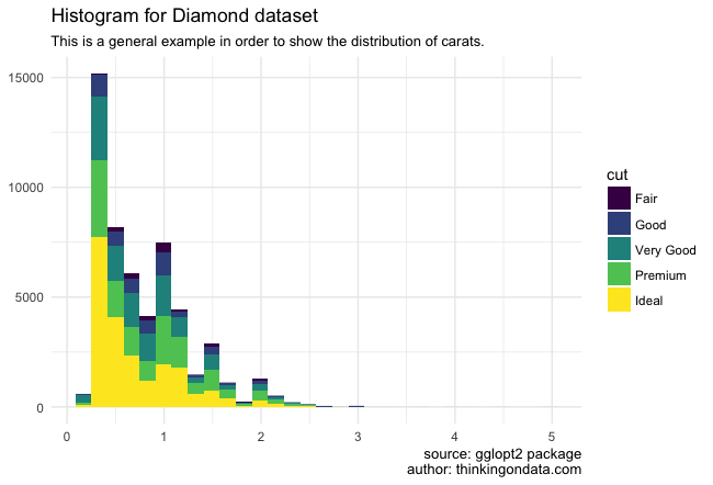
2. Sense of unity
Why do we want create a sense of unity for our set of images? Because it is easier to read the information that we are receiving if everything is harmonious: in colors, in images, in style, in sources .. We can think about information like a flow, and in that case we want a soft flow, something almost imperceptible for the reader.
At the moment of create a presentation – name it like report, project, article-, probably we are working with a set of visualizations, and before the end of the edition’s work is important create a similar style to facilitate the grasping to the reader: using the same type of letter, keeping constant the use of title and subtitle, citing the source, using the same color palette, we are creating a common format, a common language.
Understand a visualization is an effort, an effort of attention. If someone make the effort one time, we don’t recreate the same effort each time for each new image.
Some examples:
- flowingdata.com, all the visualization maintain similar characteristics, even when most of times the subjects for each post are completely different from each other.
- theeconomist.com, all the visualizations have a similar style, if we are regular readers we know their visualizations, the same position for the title, subtitles and a very similar election of colors, and when we are checking a new visualization we make focus on what the message is, not in trying to reinterpret everything (again!).
2. 1. Mix multiple graphs in one using gridExtra library
Using the library gridExtra we can create a one visualization from several ones. All the images together help us to have a better idea about the selected colors and how they work with each other. It doesn’t mean that we must use the images together in our presentation, this is to facilitate the desiciones about what is the best style for all.
Let’s gonna implement an example with two visualizations.
## Initial
vis_a <- ggplot(diamonds, aes(x = price, fill = cut)) +
  geom_bar(stat = "bin")
vis_b <- ggplot(diamonds, aes(x=clarity,fill=clarity)) +
  geom_bar()
grid.arrange(vis_a, vis_b)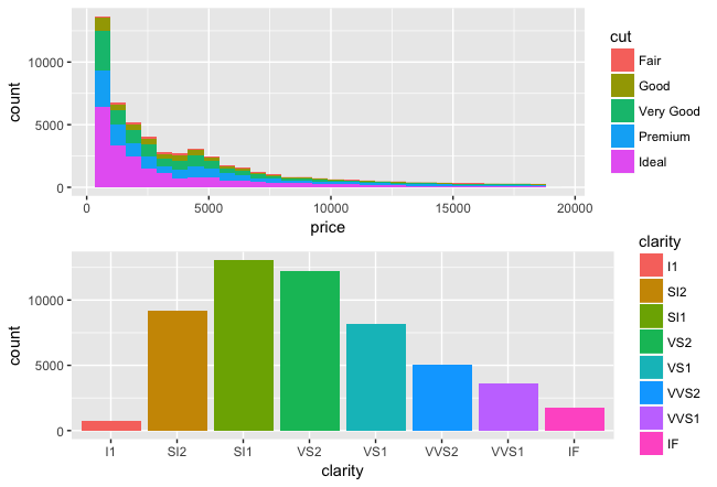
Including format:
## Testing format
vis_a <- ggplot(diamonds, aes(x = price, fill = cut)) +
  geom_bar(stat = "bin") +
  theme_minimal() +
  vis_text

vis_b <- ggplot(diamonds) +
  geom_bar(mapping = aes(x = cut)) +
  theme_minimal() +
  vis_text
We already have both visualizations with a correct format, indicating where they come from, but the lack of a palette is notorious.
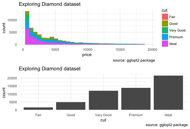
2.2. Including a professional palette
I chose two different ways to include the colors from the Viridis palette, to create a sense of unity.
## Final
vis_a <- ggplot(diamonds, aes(x = price, fill = cut)) +
  geom_bar(stat = "bin") +
  theme_minimal() +
  scale_fill_viridis(discrete = TRUE) +
  vis_text

## Picking manually 8 colors from Viridis Palette

library(scales)
q_colors <-  8
v_colors <-  viridis(q_colors, option = "D")

vis_b <- ggplot(diamonds, aes(x=clarity,fill=clarity)) +
  geom_bar()+
  scale_fill_manual(values=v_colors) +
  theme_minimal()+
  vis_text

library(gridExtra)
grid.arrange(vis_a, vis_b)
2. 3. Creating a unique visualization from multiple graphs
Sometimes it could be a good idea create an unique visualization using multiple charts, in that case we can use one of these libraries:
gridExtra library
Provides a number of user-level functions to work with “grid” graphics, notably to arrange multiple grid-based plots on a page, and draw tables.
cowplot library
This package makes it easy to combine multiple ‘ggplot2’ plots into one and label them with letters, e.g. A, B, C, etc., as is often required for scientific publications.
patchwork library
The patchwork package makes it very easy to create layouts in ggplot that have multiple panels. The goal of patchwork is to make it simple to combine separate ggplots into the same graphic. As such it tries to solve the same problem as gridExtra::grid.arrange() and cowplot::plot_grid but using an API that incites exploration and iteration.
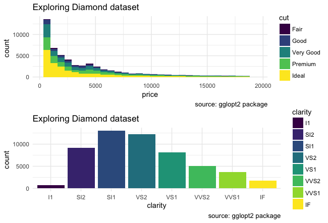
Best results
For our example, we got the best result using cowplot library or patchwork library (the final result was almost the same) over gridExtra library, but since we are working with a very limited set of examples (just one!), the best possible result could vary according with the type of graphs that you would want to join.
Code for both graphs
vis_text <- labs( title ="Exploring Diamond dataset", caption = "source: gglopt2 package")
q_colors <-  8
v_colors <-  viridis(q_colors, option = "D")
avg.y <- mean(as.double(diamonds$clarity))*10

vis_a <- ggplot(diamonds, aes(x = price, fill = cut)) +
  geom_bar(stat = "bin") +
  theme_bw() +
  scale_fill_viridis(discrete = TRUE) +
  vis_text

vis_b <- ggplot(diamonds, aes(x=clarity,fill=clarity)) +
  geom_bar()+
  geom_segment(aes(x=0, xend=.01, y=avg.y, yend=avg.y)) +
  scale_x_discrete(breaks = 1:8)+
  scale_fill_manual(values=v_colors) +
  theme_bw()+
  vis_text
Using cowplot library
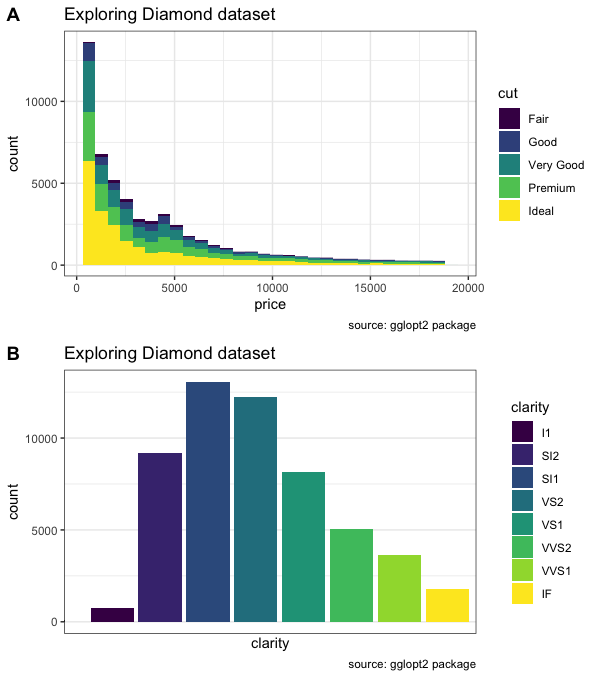
plot_grid(vis_a, vis_b, labels = c("A", "B"), nrow = 2, align = "v")
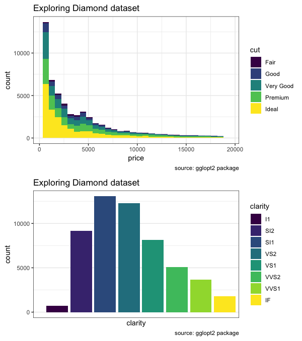
Using patchwork library
library(patchwork)
vis_a + vis_b + plot_layout(ncol = 1)  & theme_bw()
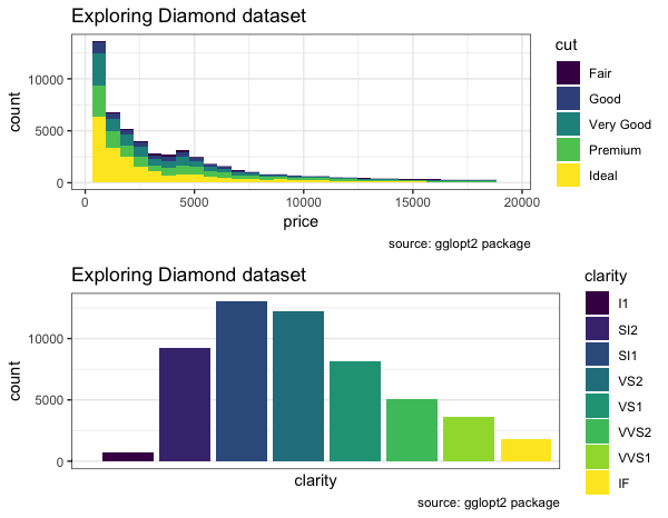
Using gridExtra library
The result is pretty similar however, the dimensions along x-axis for both graphs are different.
grid.arrange(vis_a, vis_b)
This section came from the comments made by u/snowmentality and u/AllezCannes
Conclusion
The idea of this article was to describe how to improve our images and how with very little effort it is possible to help the reader to continue reading and keep the focus.
I hope that the difference between the first and the last image is big enough to take momentum and start with the changes.
Acknowledges and reading
ggplot2 is a data visualization package for programming language R. You can learn more though the official documentation and also be inspired exploring the gallery with visualizations made using ggplot2.
An special acknowledge to Nathan Yu’s book Visualize this, which presents in one of the initial chapters the foundations about what should a professional visualization look like.